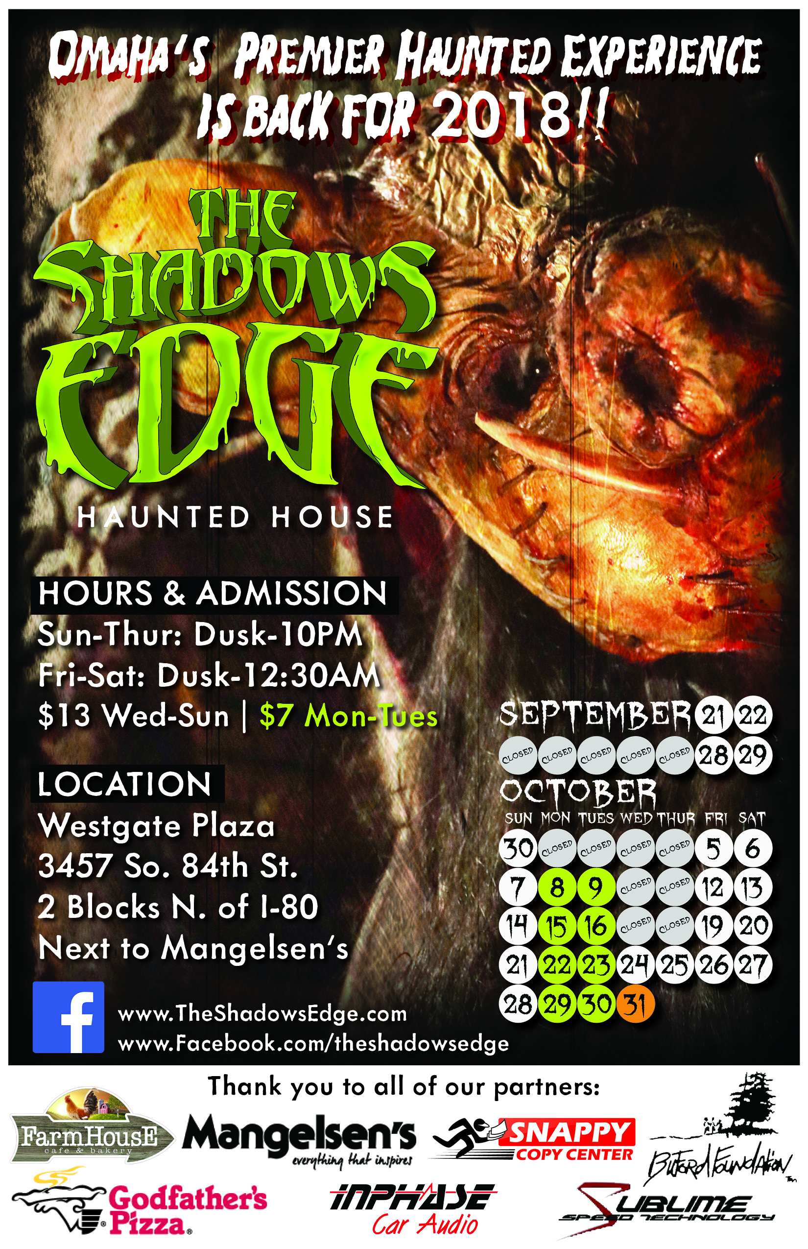
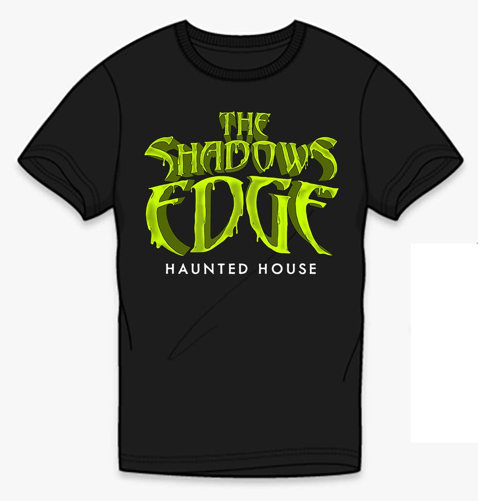
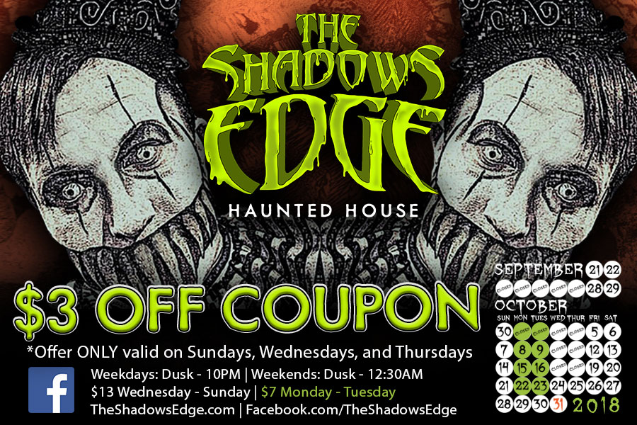
In 2018 The Shadows Edge Haunted House went through a rebranding.
As a longtime volunteer, I eventually became part of management. I was also tasked with creating the new logo and continued to create all of the graphics for the website, social media, and print.
When The Shadows Edge started in 2003 the text used for the logo was Abaddon. When I created the new logo I wanted to make sure patrons would still correlate that very recognizable font with the haunted house. For sub-headers and body copy, I wanted something easy to read with an eerie aesthetic and chose Metallophile Sp8. A lot of haunted houses tend to use red in their designs so the main logo was a bright, repugnant green with a slimy aesthetic.